Color temperature is something that a lot of artists have trouble figuring out. Basically it is talking about how light is affected by the time of day, or the color of the light in a room.
Painting is all about the effect of light on an object…or it should be. The light in a painting is what draws a viewer in. Check out Stefen Baumann’s video to see what a difference light can make: https://www.youtube.com/watch?v=07TSfmHr7PU
But we get in trouble when we don’t understand the difference between warm and cool colors. Here are some basic rules for you to think about. Now keep in mind that you need to start thinking about the kind of light you are seeing and learn to see it correctly.
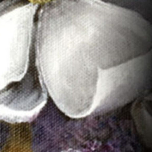
WARM LIGHT, COOL SHADOW: So, in the late afternoons or indoor incandescent lighting, the predominant light is warm (yellow, orange, red), making the light side of an object warm and the colors of the light side of the object would be a combination of the surface color mixed with the warm light. The optical effect on the shadows is a shift towards the complementary color of the light. So a warm light will shift the shadows cool, and the shadows would be a combination of the surface color mixed with the cool shade.
COOL LIGHT, WARM SHADOW: So, on overcast days or indoor fluorescent lighting, the predominant light is cool (purple, blue, green). This makes the light side of an object cool and the colors of the light side of the object would be a combination of the surface color mixed with the cool light. The optical effect on the shadows is a shift towards the complementary color of the light. So a cool light will shift the shadows warm, and the shadows would be a combination of the surface color mixed with the warm shade.
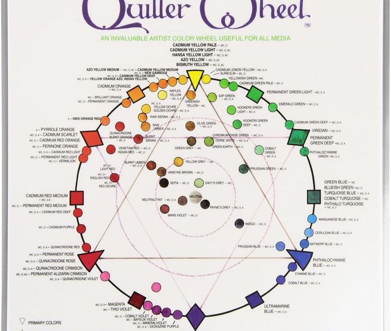
Now for the next question: How do you know what paint colors are warm and which ones are cool? That’s where the color wheel comes in. I suggest you get a Quiller Color Wheel. (Amazon link) I recommend this one because it has the actual paint names on the wheel! For instance you can see that Naples Yellow is warmer than Yellow Ochre. The wheel will also show you what colors are complementary to each other, so that you can use those to warm up or cool down your paints to achieve the warm/cool tones you need.